Originally published in The American Journal of Psychology, Volume 46 (1934), pages 537-57.
William D. Turner, Bryn Mawr College
Harry R. DeSilva, Massachussetts State College
The present paper describes a singular case of defective color perception.[1] A superficial examination of the subject (C) would seem to indicate total color blindness, but adequate methods of investigation disclose responses influenced by quality as against mere intensity of stimulus. (His performances with the Ishihara Test for color blindness taken at their face value might indicate total color blindness, but, as will be seen later, they are a result of his defective perception of contour.) The S really lacks, not physiological "color processes," but the more "central" ability to describe, interrelate, identify and make other explicit judgments regarding color phenomena as such. Except for "black" and "white" color names were meaningless to him; yet he discriminated chromatic and achromatic (neutral) colors. His differentiation among chromatic colors was rudimentary, and he did not specifically recognize the category of hue. His perceptual defects even embraced the achromatic colors. There were still other peculiarities which showed no obvious relations to his color anomalies: perception of contours and patterns was poor, and contours tended, if steadily fixated, to change their form, to blur very rapidly, and often to disappear entirely. This "blurring" differed both in its rate and qualitative characteristics from ordinary visual fatigue or local adaptation.
Attention was first drawn to this 19-year-old S when he complained of unusual difficulties in verifying the laws of color mixture. His naming of colors was hesitating, generally incorrect, and inconsistent from time to time. He stated that the words green, blue and gray meant nothing to him and that his use of them was based somewhat haphazardly on what others had told him about colors of things. He could not name from memory the color of a two-cent stamp (red), nor say whether the stripes in the American flag were red or blue. What color vision he had was of no practical use to him, for his choice of garments depended on the tastes of salesmen and his companions. Yet he alone seemed to be aware of his color difficulties, and supposed that they were due to a lack of intelligence on his part. (By the Army Alpha Intelligence Test his intelligence quotient was found to be above the average.) He could perceive ordinary pictures (colored or uncolored) without seeming difficulty.
Ophthalmoscopic examination showed normal ocular media and fundi. C was slightly hypermetropic and astigmatic: the necessary correction was: sph. +0.75, cyl. —0.25, ax. 90, for each eye. The subnormal visual acuity (20/30 for each eye) is accounted for completely by this refractive defect, since with correcting glasses C's visual acuity was better than 20/20. His binocular amplitude of accommodation was 7.5 diopters. He read ordinary print without difficulty. The correcting glasses reduced eye-strain appearing with extended reading periods.
Moderately bright lights were "unpleasant" and "glaring" to him, but not painful, and could readily be borne. His squinting of his eyes, wrinkling of his brow, and his tendency to turn his head and voluntarily to shift his eyes away and then back to a figure being regarded were due, not to a central scotoma (the high visual acuity and the charted visual fields preclude that!), but to his peculiar defects of contour vision which were more pronounced in central vision. His shifts of fixation were definitely voluntary and were not of the nystagmic variety generally accompanying total color blindness.
C's parents and only sister passed the Ishihara Test as normals; the former knew of no color difficulties in their own parents. C had no symptoms of hysteria, nor was there any history of serious disease or brain lesion.
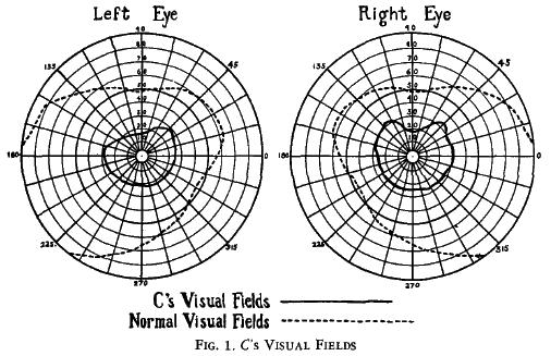
(1) Visual fields. C's markedly reduced visual fields are shown in dotted lines in Fig. 1. In obtaining them a 2-mm. white stimulus target against a dark gray campimeter was used.
(2) Absolute light thresholds. C's photopic and scotopic sensitivity to light were subnormal, and correspond with his reduced visual fields, his spectrum (shortened at both ends), and the data on dark adaptation and flicker mentioned below.
(3) Dark adaptation. By means of a Nagel Adaptometer C's ascending and descending absolute thresholds were determined alternately. Average light intensities (thresholds in terms of adaptometer readings), each of which was based on one "appearance" and one "disappearance" judgment for adaptation periods of 10, 15, 20, 25, 30, and 35 mm. respectively, were: 650, 200, 70, 45, 25, and 20. For a normal S (Turner) the thresholds were 35, 30, 10, 5, 4, and 3. Turner's first reading is probably subject to an experimental error. If it is disregarded, the remaining ratios between the two Ss' thresholds for each adaptation period are practically constant: 7, 7, 9, 6, and 7. Thus, C's relative increase in sensitivity under dark adaptation is about normal, although his absolute threshold remains above normal.
(4) Flicker. C saw no flicker in a black and white disk rotating at a speed producing fine, and occasionally even coarse, flicker for a normal subject. A low light sensitivity most readily accounts for the low fusion frequency.
(5) Photopic luminosity.[2] By presenting a homogeneous field of spectral light and asking C to report changes in its brilliance as the wavelength was suddenly changed in steps of about 10 mX. [3] C gave with assurance but subnormal precision judgments indicating that the brightest part of the spectrum was in the yellow region with steadily decreasing luminosity on either side of this maximum. His maximum, although not precisely determined, was at least within 10 mX of the normal. (With the same spectrum-- that of a 6-volt incandescent lamp energized by a constant current-- the maximal luminosity for a normal subject was at 570 mX [yellow].) This conclusion is supported by results obtained with the method of flicker photometry in which spectral colors were equated for brilliance with white light. Time permitted only enough measurements to establish the fact that C's curve was roughly symmetrical with a maximum in the neighborhood of 580 mX. Under the same conditions the normal S's curve was approximately symmetrical with a maximum at 570 mX. With more accurate determinations one would expect to find C's luminosity curve normal with respect to shape and maximum.
C's spectrum was shortened at both ends. With very strong spectral light a normal S could see wave-lengths shorter than 400 mX. and longer than 800 mX, whereas C's spectral limits under the same conditions were at 413 mX. (in the violet) and 790 mX (in the red).
(6) Scotopic luminosities. C's relative sensitivities to wave-lengths were also normal in scotopic vision. After 15 mm. of dark adaptation, yellow, orange, blue, and red disks were presented in weak and slowly increasing illumination. One by one they reached a normal S's threshold of visibility in the order given; while with greater absolute illumination C detected first the yellow and green disks together, then one by one the orange, blue, and red in the order given.
(7) Differential light thresholds. C's differential sensitivity was tested by presenting a gray paper figure on a gray background, and by varying the illumination of the figure until he could perceive it as distinct from the ground. With short fixations he could differentiate figures from backgrounds with slightly subnormal efficiency. (With longer fixations his defective contour vision led to the rapid "fusion" of the figure into the background [vide infra, Contour vision]).
(1) The unique status of black. An effort to teach C the meaning of brilliance or brightness disclosed a new anomaly: while looking at a gray and a black paper he protested that the statement, "The gray is brighter than the black," was meaningless to him. He preferred to call black the brighter color; in fact, black was the "brightest," strongest," or "most intense" of all his colors. Black paper gave him a "stronger" sensation than white paper or even the direct view of a bright electric light which was for him "unpleasantly glaring."
In addition, it was later found that in making judgments of brightness C spontaneously used terms which were the reverse of the normal. When the intensity of a field of surface or film color was diminished, he most naturally described the change as one of "increasing brightness." He was, however, aware of his terminological peculiarity and could, when requested, report in "our [normal] language;" he would then characteristically pause a moment to "translate."
C's black had not only striking phenomenal properties but also very positive functional ones. In the normal irradiation experiment a white square on a black ground looks larger than a black square of corresponding size on a white ground; but to C the black square looked definitely larger.[4] The section on Achromatic Contrast (vide infra) further illustrates the strength of C's black process. If one still needed evidence to prove that black sensation corresponds to real physiological excitation (rather than to an absence of excitation), the foregoing facts would almost suffice for the proof.
(2) Surface colors.[5] C manifested a disturbance of achromatic color perception which differed strikingly between film and surface colors. In studying these peculiar differences achromatic surface colors were first employed: C was shown a number of neutral papers ranging in shade from white to black. He called the lightest paper "white" and darkest paper "black." For the intermediate shades he had no name; the word "gray" was one he never used and could not understand. If the papers were arranged side by side in order of brilliance, C could detect no serial relationship between the colors. He said: "I see black at one end of the row, and white at the other end, but why you put them there with the other colors I do not understand." When the white and black papers were removed he said: "I see some colors which are somewhat different from one another. How they differ I cannot tell. I cannot see why you group them as you do, or even why you put them together at all." Viewing the three darkest papers alone he called the darkest one "black," and could say that the darkest one was "more like black" than the third color. Of the three lightest papers, he called the lightest "white," and, though he saw them as "different from each other," he could not say which was more like the white. It is well to note that these "comparisons" were difficult for him.
Questioning and testing C disclosed that his difficulty was not one of inability to grasp the concept of series as such, but was due to the absence of a real perceptual series in this particular case. Lack of training with the particular sense-material also fails to explain his defect, since a three-year-old child was able to construct a gray series after having once seen one.
At this point a discussion of normal perception may illuminate the peculiarities just described. Although some visual theorists regard achromatic color as unidimensional, there are reasons for distinguishing at least two aspects of achromatic color.[6] First, to normal Ss an ordered row of gray papers (like that presented to C) exhibits a series of intensities or brilliances, and at the same time a series of qualities progressing from white through the various nuances of gray to black. Secondly, consider that in the phenomena of color constancy the quality of black or white objects survives almost completely changes in illumination by white light, and especially that, while a black object (perhaps reflecting even more light than a particular white object) remains black, it still appears more intense, more "impressive," or even "brighter" than the white. Here the quality of achromatic color remains practically constant; its intensity varies. (Note that the quality, not the brilliance or brightness, is constant; and that the commonly used term "constancy of brilliance" is misleading, and had best be supplanted by a term such as "constancy of achromatic quality.") Thirdly, achromatic quality as such seems to appertain primarily to surface colors. Gelb[7] describes a S with a cerebral injury who perceived all colors as film colors, who could not perceive any "white" or "black," nor remember what these terms had previously meant to him. Krauss[8] maintains that totally color-blind Ss manifesting no constancy do not see even achromatic qualities, because they do not perceive illumination as such.
One is led to conclude from C's inability to match chromatic and achromatic surface colors with respect to intensity (vide supra, Photopic luminosities) that intensity as a dimension could not be abstracted from the total surface color situation, and that quality and intensity were inextricably knit together in an unanalyzable, global or totalized perception. C was apparently encountering this same difficulty with the achromatic surface colors mentioned above in this section. When one considers that the end members of the gray series (the white and the black) were each more "intense" or "strong" than any other colors he knew, one can readily appreciate the obstacles hindering his perception of any serial or "family" relationship in the black-gray-white series. Further, assuming the unanalyzable status of surface color intensity, and the ambiguity of the term intensity created by the unique status of black and white, the anomalous position of the grays in C's surface color system and their lack of clear cut relations to each other and to black and white become comprehensible. Surface "grays" were to him isolated colors with no abstractable or identifying dimensions.
(3) Film colors. The behavior of C's film colors sharply contrasts with that of high surface colors. He could easily judge the intensity (or "brightness') of film colors. Spectral fields could readily be judged and compared in this respect even when they were heterochromatic. However, with regard to achromatic film colors C was (with one exception) unable to use the words white and black; he described them as being simply "brighter" or "darker" ("duller," "dimmer"), The normal person uses the word white to describe a brilliantly illuminated white surface seen through a reduction screen, a brilliant, frosted electric lamp, the moon, the sun, and clouds; but C refused to call the first two objects "white," and could think of no color name for the last three. Likewise a normal S called "black" a small hole in the white screen just mentioned, and also the shadow of a hand in the field of a projection lantern. C, however, could agree to none of these appellations; except for the field of his closed eyes he never saw film colors or shadows as black, no matter what their darkness. With the one exception C perceived achromatic film colors entirely as intensities and not as qualities, and he thus agreed with Gelb's case in indicating that achromatic quality attaches primarily to surface colors, intensity or brilliance to film colors.
There is often a tendency for normal Ss to speak of the brilliance of achromatic surface colors rather than of their quality. A cloudy, night sky is often "dark" rather than "black;" the sun is often "brilliant" rather than "white;" and the faintly illuminated field of the photometer is "dim" rather than "gray." Even a normal S's perception seems to indicate the lability of achromatic quality as a dimension of film color.
(4) The "constancy" of achromatic color. A piece of black paper illuminated by a nearby, strong, electric light looked "black" to both a normal S and C, when they were allowed to view the total situation; and a piece of white paper illuminated by a distant, weak lamp was called "white" by both, even though the black paper actually reflected more light than the white one. When the papers were viewed through a reduction screen both Ss called the black paper "brighter" ("dimmer" in C's natural terminology). Thus, for C, as for normal Ss, "whiteness" or "blackness" is relatively independent of the physical intensity stimulating the retina.
(5) Achromatic contrast. Two rotating disks, each containing originally 50% white and 50% black, were presented in front of black and light gray backgrounds respectively. The disk in front of black was held constant at 50% each of white and black and the percentage of white in the disk in front of the gray background was increased until C reported that the two disks looked "the same." With short exposures, and when the disks were separated sharply in the third dimension from their respective backgrounds, C's contrast effects proved to be approximately normal.
With long exposures and with the disks close to their backgrounds, the white in the disk in front of the gray had to be reduced to 20%, since the other disk was darkened by the mixture of its background with itself. Such "fusions" of the color of figure and background were one aspect of C's defective contour vision (vide infra, Contour vision). It is interesting to note that a more extended investigation may disclose in C a supernormal contrast effect compensating for such defects of contour vision.
(6) After-images. Positive after-images of a brilliantly illuminated white cross on a black ground were obtained, as were also negative after-images of longer duration. The latter persisted for shorter times than did those of normal Ss. No satisfactory evidence was obtained for chromatic after-images or contrast; these phenomena would obviously be difficult to demonstrate.
(1) The Ishihara and Nagel tests. C was given the Ishihara Test for color blindness first in the usual fashion, and later with the aid of an epidiascope which projected well saturated figures enlarged to 70 cm. in breadth. Under both sets of conditions C reported on what he saw during the first few seconds of observation. In viewing the enlarged figures he wore glasses correcting his refractive defects, and stood at a distance of 180 cm, Table 1 itemizes C's performances and those of a normal, a totally color-blind, and a red-green blind subject. (In Plates 1-13 the patterns to be perceived are numbers; in Plates 14-16 they are wavy lines which the subject is asked to trace. Note that C's performance with the enlarged plates might be judged as slightly better than that with the plates of standard size.) It will be seen that C might casually be diagnosed as totally color-blind. However, he was completely unable to cope with Plates 10, 11, and 16, whereas a totally color-blind person would have had only some difficulty with them. A diagnosis of C as almost totally colorblind is not only inadequate but utterly misleading, both in the light of his peculiarities already mentioned and those about to be discussed. No ordinary test is adequate to his case.
With the Nagel Cards, all the dots in each ring looked alike with the exception of those normally designated as "red;" these dots C designated as "standing out from the others." Since the Nagel Test requires the use of color names, it was obviously beyond C's powers.
| C's performance | |||||
| Plate No. | Standard plates | Enlarged plates | Normal S | Totally colorblind S | Red-green blind S |
| 1 | 12 | 12 | 12 | 12 | 12 |
| 2 | 0 or 8 | 0 | 8 | Difficult | 3 |
| 3 | 0 (doubtful) | Cannot read | 6 | Difficult | 5 |
| 4 | Cannot read | 6 (doubtful) | 5 | Difficult | 2 |
| 5 | Cannot read | 9 | 74 | Difficult | 21 |
| 6 | Cannot read | 8 | 2 | Difficult | Difficult |
| 7 | Cannot read | 0 | 6 | Difficult | Difficult |
| 8 | Cannot read | Cannot read | 5 | Difficult | Difficult |
| 9 | Cannot read | 9 | 7 | Difficult | Difficult |
| 10 | Cannot read | Cannot read | Difficult | Difficult | 5 |
| 11 | Cannot read | Cannot read | Difficult | Difficult | 2 |
| 12 | Cannot read | Cannot read | 26 | Difficult (?) | (26) |
| 13 | Cannot read | Cannot read | 42 | Difficult (?) | (42) |
| 14 | Cannot read | Cannot trace | Traces red | Cannot trace | Traces blue |
| 15 | Cannot read | Cannot trace | Traces | Cannot trace | Difficult |
| 16 | Cannot read | Cannot trace | Difficult | Difficult | Easy |
(2) The "strikingness" of spectral colors. While matching spectral colors with white light in respect of brilliance (vide supra, Photopic luminosity), C remarked that one color (a spectral blue) was especially hard to match. This color he described as being "peculiar" or "striking." Later he reported that the spectral red was also "striking" but less so than blue. Greenish hues were rarely, yellow and orange-yellow were never, called "striking." His reports upon the "strikingness" of a number of wave-lengths presented haphazardly as shown are given in Table 2.
C continuously regarded a field of spectral color while its wave-length was progressively increased, beginning at a wave-length in the middle of the spectrum. He began at a fairly delimited transitional region to report definite "strikingness." (Seven trials yielded the wave-lengths of 656, 703, 682, 710, 684, 664, and 660 mX.) Decreasing the wave-length from the original starting point disclosed another such transitional region (located in six trials at 480, 478, 478, 504, 478, and 480 mX. respectively). The individual determinations of long-wave and short-wave transitional regions were made alternately.
What did "strikingness" mean? Since for normal Ss the end regions of the spectrum are more saturated than the middle, one might conjecture that strikingness is simply "coloredness" or saturation, and that C's system of chromatic quality comprehended not the two dimensions of hue and saturation, but only one of "coloredness." That strikingness was related to saturation was indicated by C's report of "more striking," when a second blue filter was inserted into a projection lantern which was already giving a rich blue field. But the status of spectral violet for C detracts from the "one-dimension hypothesis." Normally violet is more saturated than spectral blue, but C described it as "not striking, but unpleasant." (C said that the unpleasantness was in the appearance of the color itself, and did not come from any feeling of eye-strain.) If one assumed that violet had a special "chroma value" for C, the foregoing hypothesis would remain tenable; but such logic bases one assumption on another, and evidence from the experiments on color matching tend to invalidate the hypothesis anyway.
|
Wavelength |
Normal color |
Degree of "strikingness" |
|
470 |
blue | not so striking |
| 530 | yellow | rather striking |
| 650 | orange | not striking |
| 570 | yellow | striking |
| 540 | yellow-green | striking |
| 470 | blue | striking |
| 600 | orange | not striking |
| 500 | blue-green | not striking |
| 520 | yellow-green | not striking |
| 550 | yellow-green | not striking |
| 450 | violet | not striking, very unpleasant |
| 490 | blue-green | not very striking |
| 680 | red | fairly striking |
| 700 | red | fairly striking |
| 580 | yellow | not striking |
| 630 | red | fairly striking |
| 660 | red | fairly striking |
| 480 | blue | striking |
| 440 | violet | unpleasant |
| 430 | violet | unpleasant |
(3) Color matching. The following experiments reaffirm previous indications that C had some chromatic perception, and that he could under certain conditions distinguish chromatic colors as a class from achromatic colors.
The following abbreviations will be used to designate the various colors used:
R = red, 0 = orange, Y yellow, G = green, B = blue, P = purple, L lavender, YG =
yellowish green, BG = bluish green, RP = reddish purple, BP = bluish purple, and Gy = gray. The prefix
"u" means "unsaturated," and "vu" means "very
unsaturated." The R, B, and P disks were, to the normal observer, very highly
saturated, the other disks considerably less so, and the disks qualified by "u"
or "vu" had very weak saturation.
To test C's ability in color matching he was handed in "Series I" a disk of colored paper (6.5 cm. diam.) and asked to find one like it among a group of disks of the same size and texture which were spread out in a haphazard spatial order on a black cloth. (The cloth lay on a table near a window, and was illuminated by light from a clear sky; the spatial arrangement of the disks was changed from trial to trial.) Besides one or more chromatic disks the group included 18 neutral disks ranging by small steps of color from a very dark to a very light gray. (Black and white disks were excluded because there was no uncertainty about their recognition and discrimination.) In "Series II" a white cloth background was used. (The minor differences between Series I and II were quite possibly due to fatigue.)
Table 3 presents the results of Series I and II. The second column shows the chromatic colors present in the group from which the choice was made during the various "color situations" (numbered 1 to 32 in the first column; except in Situations I 31, 32, the 18 neutral colors were, of course, also present.) The third column contains the various samples which the S had to match, and his choices are recorded in the fourth and fifth columns for Series I and II respectively. "No match" indicates that the S was unable to find any color in the group to match the sample he held. Footnotes contain significant comments made by the subject during the matching.
First, a B disk was placed among the neutral disks on the cloth, and S was given an exactly similar disk to match. Without hesitation he chose correctly-- a performance no doubt easily explainable by the "strikingness" of B. However, under analogous conditions he readily matched a R, and even a Y, a G and other colors![9] Chromatic colors resembled their corresponding samples more than they did the grays! (Exceptions to this performance were found with O, R, P, L, and uP samples; Choices: II 7-10.)
| C's choice | ||||
| Color situation no. | Colors presented | Sample to be matched | Series I | Series II |
| 1 | B | B | B | B |
| 2 | R | R | R | |
| 3 | G | G | G | G or Gy |
| 4 | Y | Y | Y | Y or Gy |
| 5 | P | P | P | |
| 6 | BP | BP | BP | |
| 7 | RP | RP | No match (f) | |
| 8 | O | O | No match (g) | |
| 9 | L | L | No match | |
| 10 | uP | uP | Many Gy's | |
| 11 | vuB | vuB | vuB | |
| 12 | B, uB | B | B | |
| 13 | P, uP | P | uP or Gy | |
| 14 | R, uB | R | uB | |
| 15 | R, uB | vuB | R or vuB | |
| 16 | R, vuB | R | vuB | |
| 17 | G, uP | G | uP | |
| 18 | G, uP | uP | uP or G | |
| 19 | G, Y | G | G or Y (a) | |
| 20 | G, Y | Y | G or Y (b) | |
| 21 | B, R, G, Y | B | B (or G?) (c) | |
| 22 | B, R, G, Y | R | B (d) | |
| 23 | B, R, G, Y | G | B | |
| 24 | B, R, G, Y | Y | B | |
| 25 | B, G, Y, P | P | B (e) | |
| 26 | B, YG, L, P | P | B | |
| 27 | B, P, G, O, Y, RP | RP | B | |
| 28 | G, P, RP, YG | B | G | |
| 29 | G, P, RP, YG | R | No match | |
| 30 | L, P, RP, YG, BP | BP | No match | |
| 31 | B, R, G, Y | R | B | |
| 32 | B, R, G, Y | G | B | |
(a) Neither Y nor G looks like the Gy's, but I cannot say which of them looks
more like the sample.
(b) Same remark as in (a).
(c) Either B or C would match. B is more striking.
(d) R, G, or Y would match. I chose B because I like it best.
(e) P was the second best match.
(f) RP is not like the sample, but I like it more than any of the others.
(g) O is not like the sample, but is nearest.
But when the four chromatic colors, R, Y, G, and B were present among the group of grays on the cloth and the S was given a R to match, he said, "The sample is hard to match." He pointed out the four chromatic colors as being more like the sample than were the others, but when asked to choose the one of the four most like the sample, he chose, not the R, but the B, saying, "Any one of the four would do, but I choose this one, though I do not know why." The same result was obtained with a Y or G sample! Why?
When asked to point out the most striking color in the group he indicated the B. In every experiment in which the highly saturated B was present among the group from which he had to choose, he chose it, regardless of the hue of the chromatic sample! (Cf. Table 3, Choices: I 12, 21-27; II 12, 31, 32.) Accompanying this predilection for B was his pronounced and peculiar reluctance to refer to the sample even during difficult matches. After one glance at it he would lay it face down on the table and ignore it. Frequently, when a match was apparently impossible, and when he was forced to choose, he would select the B, saying, "I do not know why I pick this; perhaps it is because I like it." Under these conditions, he would even refuse as a match the disk exactly similar to the sample, even when it was offered to him! He was not matching colors. He was making, not "relative," but "absolute" choices.
When the S was asked to arrange in decreasing order of "strikingness" the four chromatic disks, R, Y, G, and B, together with the achromatic white, black, and grays; he placed the black first, white second, B third, then R, Y and G, in a group, and finally the grays. When asked to arrange the disks in decreasing order of aesthetic preference, he indicated exactly the same sequence. Evidently "strikingness" in its most general sense meant something like "impressiveness". (It is interesting to note, but difficult to explain, why the red pigment was not striking; spectral red was denoted as striking.)
A most significant fact is that C's preference for B still manifested itself even when it was presented in unsaturated or highly unsaturated form, and in company with a well saturated R (which was itself equal in strikingness to Y and G, and more striking than the grays). This result agrees with the anomalous status of violet (vide supra, the "strikingness" of spectral colors) in casting doubt on the hypothesis that the C's chromatic system was confined strictly to the single dimension of saturation. If his "saturations" were roughly normal, then on the bases of the unsaturated status of violet and his preference of vuB as against a saturated R, one must conclude that his perception was not only a perception of "so much strikingness," but also a perception of a qualitatively more or less specific "strikingness," a vague and unformulated awareness of hue. It is difficult to see how he could have chosen uB and vuB except on the basis of a qualitative resemblance to B.
Why then was he unable to match colors with respect to this attribute, or to recognize the difference between hues, or their identities? Present knowledge permits only the comment that what perception of hue existed did so in a curiously "latent" form.
In C's unusual performance while taking the Holmgren Wool Test (the results of which are given in Table 4), one sees a decided tendency to "match" a group of colors similar to each other in hue, although quite different from the sample. The best account of these results would involve C's latent capacity for hue discrimination, assisted by the close juxtaposition of a great number of highly saturated colors of different hues. But here, as before, his failure to match the sample by the group chosen remains enigmatic. (C remarked as he made his choices, "I have no idea why I pick these colors.")
|
Sample |
C matches the sample with |
| red | 6 greens |
| medium blue | 5 browns |
| saturated blue | 2 purples, 2 greens |
| tan | no match (C said it was white, and could find no others like it) |
| green | 7 reds and pinks |
| brown | 2 lavenders, 5 tans |
| light blue | light tans, light oranges, and light lavenders |
| pink | no match |
(4) Discussion of C's color vision. A final analysis of C's color perception is not possible with the data at hand. His defect certainly differs from simple color blindness, for a totally color-blind person would not have distinguished the "colored" from the "colorless." To account for his behavior one needs to assume a vestigial perception of hue, even though his introspections and color matches show that he could not judge hue as normal persons would have done. His anomalies of judgment cannot be attributed to retinal or cerebral mechanisms implied by the name color blindness," they must be ascribed to abnormal functioning of "higher" levels of the visual nervous system.
Of course, some "lower level" color blindness or color weakness might coexist and operate with the higher level anomaly. But how can it be discovered? No suitable test for the defect is yet at hand. Tests requiring the matching or naming of colors are obviously unsuitable. A test demanding only the perception of patterns or figures, discriminated from their backgrounds on the basis of hue, would be adequate were it not for C's defects of contour vision. Yet even now one can say that C is not red-green blind; a red-green blind S would have chosen red and green Holmgren wools indiscriminantly to match either red or green. Moreover, C reported no figures in the Ishihara Test which a red-green blind S can read and a normal S cannot. Nor is the spectrum shortened at the red end alone, as in protanopia (the most frequent subtype of red-green blindness). C is certainly not red-green blind.[10]
(1) General characteristics. Under certain conditions when C maintained fixation of figures for a few seconds, four sorts of changes occurred in the figures, which seem in principle to be distinct: (1) alterations of form, (2) disintegration of contour, (3) metamorphosis of surface to film color, and (4) leveling out of brilliance differences between parts of the figure or between the figure and its background.
If steadily fixated, a 7.6-cm. white square lying 150 cm. distant on a black background rounded off its corners after a few seconds and became a smaller circular figure with sharp contours; then after a few seconds more there resulted a blurred figure whose color was more like that of the background and was filmy in appearance. The change in color appeared over the whole figure all at once and its onset was sudden. (Except where otherwise stated, the figures mentioned in this section were white, and were placed on or before black backgrounds.)
Neighboring figures, when steadily fixated, would suffer peculiar changes in form (to be noted below) and would even coalesce. Two 7.6-cm. squares with their sides in alignment and lying 2 or 3 cm. apart would after a few seconds join to form a solid white rectangle with sharp contours.
C could somewhat control the rate of progress of these phenomena, shortening or lengthening the interval preceding their onset, but he could rarely prevent their ultimate occurrence, if he maintained fixation. When he made an effort to coalesce two 1.3-cm. squares, 1.3 cm. apart, they coalesced after 3 sec. When he tried to keep them apart, the time was increased to 7.5 sec. During the experiments described below he maintained a passive attitude towards the phenomena, except where it is otherwise stated.
(2) Factors in C's contour vision. In a dimly lighted room C was allowed to look with his right eye through a small camera shutter at figures 150 cm. distant and illuminated by two 40-watt "daylite" lamps. When the camera shutter was opened he started a stop-watch, and stopped it when he experienced a predesignated figural change. The effectiveness of a given factor for such changes was stated in terms of the rapidity with which it induced the change. Thus the rounding-off time (or the interval elapsing before the corners of a square rounded off), the blurring time (or the interval elapsing before the contours of a figure disintegrated), or the coalescing time (the interval elapsing before two squares coalesced) was taken as a measure according to the stimulus-situation of convenience. Except where it is otherwise stated, the time-averages given below are based on 5 observations each. (In a good share of the cases the probable errors of the averages, if calculated, would be as large as or larger than the averages themselves, and the differences between the adjacent averages would not be statistically significant; but in no single case was there an inversion in the series of averages.)
(a) Size of fields (figures). Smaller figures blurred sooner, and a unit change in figural size affected the blurring time of smaller figures more than that of larger ones. Thus squares 2.55, 5.05, 7.6, 10.15, 12.70, 15.30, 17.70 and 20.30 cm. wide blurred respectively after 4.8, 6.4, 7.7, 8.1, 9.4, 12.4, 12.4, and 14.2 sec.
(b) Locus of fixation. Figural changes occurred more readily in central than in peripheral vision, C fixated a dot in the center of the background and attended to a 7.6 cm. square placed beside it at various distances. At visual angles (from the fixation dot) of 30°50', 7°40', 11°0, and 14°55' (At visual angles greater than 15° figural changes were not readily observable), the square rounded off after 3.9, 6.5, 8.1, and 12.2 sec. respectively. (These averages were based on two observations each.)
(c) Relative brilliance of figure and background. Figural changes occurred sooner with smaller brilliance-differences between the figure and background. Six Hering grays (7.6-cm. squares; Nos. 47, 43, 31, 25, 20, and 10—from dark to light gray) rounded off after 3.0, 3.6, 3.7, 4.4, 4.8, and 4.8 sec. respectively. They blurred after 5.8, 6.0, 7.3, 8.1, 8.6, and 9.1 sec. respectively.
(d) Proximity of figures. Two 7.6-cm. squares coalesced more rapidly when they were closer together. Thus, when respectively 1.3, 2.55, 3.8, 5.05, 6.35, and 7.6 cm. apart, they coalesced after 2.8, 3.5, 4.5, 5.5, 10.0, and 17.0 sec. With greater separations the rectangle formed was "not so solid" in appearance.
(e) Perception of depth. Figures did not change as a rule when they were binocularly perceived as being some distance in front of the backgsound; only occasionally very slight changes appeared. A single square 31 cm. before the background did not change at all. Two squares 1.3 cm. apart and 2.55 cm. before the background coalesced, but the rectangle formed was not solid. Two squares did not coalesce when one was on the background and the other was "close beside" it but 10.2 cm. in front of the ground.
(f) Contour regularity. Excepting circles, figures with regular contours changed more readily than those having sharp angles in their contours. Thus, briefly: Circle became smaller after a few seconds; contour and original color maintained, Square-like figure (with one side sharply concave): became darker; form maintained. Equilateral triangle." form maintained until contour disintegrated. Square." became circular before contour disintegrated. Octagon: became circular immediately; contour disintegrated relatively much later. Letter R: form and contour maintained even after 30 sec. Human profile (upright): "looked like a stubby cucumber" after 30 sec.; contour disintegrated 15 sec. later. (When inverted): changed in exactly the same fashion.
(g) Figure-ground relation. Parts of a field seen as figure changed less readily than those parts seen as ground. Fig. 2 was presented on a black background. When regarded as a black ring on white paper, the small white square blurred and became black after 25 sec. When the small white square was regarded as figure, it blurred after 31 sec. When Fig. 3 was also presented on a black background, and was regarded as a white ring on a black ground, the black square receded to half its original size after 27 sec. When the black center was made figure it became only slightly smaller after 30 sec.
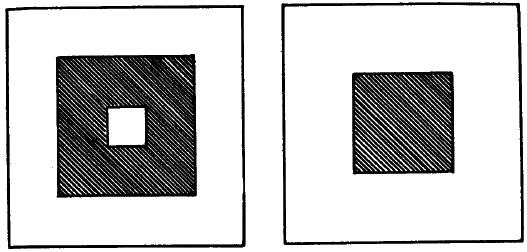
Figures 2 (left) and 3 (right).
(h) Participation in totalities. Adjacent areas which belonged to larger totalities either coalesced or failed to coalesce so that the characteristic totality was maintained.
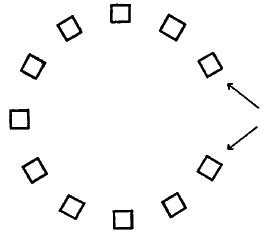
Figure 4
Thus when one of two 7.6-cm. squares, 3.8 cm. apart, was fixated and regarded as figure it became circular; when it was again fixated, but both were made figure, the squares coalesced. When the two 1.3-cm squares previously mentioned were incorporated in Fig. 4 (as shown by arrows), and when the figure was regarded as a circle, they coalesced after 5 seconds; but when the figure was regarded as a letter C, they coalesced after 14 sec. When these same squares participated in Figure 5 (as shown by arrows), the squares composing the separate circles coalesced rather solidly after 14 sec., but the squares under consideration did not coalesce, though they were as close to each other as they were to the adjoining members of their respective circles.
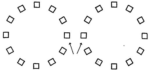
Figure 5
(i) Special changes in contour with proximity of larger figures. When the figures shown at the left of Fig. 6 were placed a few centimeters to the left of a larger circular disk of the same brilliance, C represented their appearance by drawing the corresponding figures at the right of Fig. 6. When the large disk was removed, he drew them as they really were.
Figure 6
(3) Relation to normal visual phenomena. With continuous fixation normal, local adaptation or "fatigue" levels out differences of brilliance and blurs contours. But C's "blurring effects" differ in being much more rapid and in involving apparently an interaction between adjoining visual areas such that there is an actual mixture of spatially separated processes. Thus, a gray area on a black ground appeared darker than an identical area on a light gray ground.[11] Furthermore, the effects upon C's "blurring" of such factors as the perception of depth, of form, and of figure and ground, and the operation of his volition in those functions indicate that the effects are not retinal in nature.
Although C's absolute threshold for sound was approximately normal, he was practically tone deaf. In discrimination of pitch, as determined by the Seashore Test of Musical Ability, he ranked below 97%, and in tonal memory below 95% of the population sample given in the norms. At present these results cannot be unequivocally interpreted.
Is there some common factor underlying C's various perceptual peculiarities? One might suppose that the blurring contours and their attendant equalization of color fields might interfere seriously with the adequate recognition and discrimination of colors. However, it must be realized that the factors of gross surface texture, solidity, tridimensional separation of objects from backgrounds, and eye-movements prevent the blurring effects so marked in the foregoing experiments, and that thereby C's perception of contours and forms would suffice to offset the mutual destruction of adjacent color fields. No relation between his perceptual defects of color and contour seems to exist.
Again, the equivocal meaning of term perceptual defect must be made clear. C differentiates chromatic and achromatic colors, and some of his color matches indicate that in some sense hues exist in his color world; in this sense he "perceives" color or hue. However, his failure actually to match colors or to judge certain of their attributes implies that in another sense he does not "perceive" hue. To describe his defect adequately and precisely one must differentiate between "seeing" as a primitive "sensing," and analytic perception with its sharply defined categories and explicit judgments. It is C's color perception which is disturbed.
(1) The subject of this investigation manifests a unique anomaly of color perception, which is not simple color blindness, but a more central defect. Color names (with the exception of black and white) convey no meaning to the 5, and in other respects he gives the appearance of total color blindness. Nevertheless, color matching tests demonstrate that he has color vision, inasmuch as he can distinguish chromatic colors as a group from whites, grays and blacks, although he is quite unable to match colors with respect to hue. Verbally he can differentiate the various chromatic colors only in respect of their "strikingness," a characteristic which seems to correspond more or less closely to the normal S's concept of saturation. Yet his behavior in color-matching experiments suggests a rudimentary discrimination of hue-- even though he can render no judgments on the identity or difference of colors with respect to this attribute.
(2) There are also peculiarities in this S's perception of achromatic colors. Among these is an abnormal intensity of the black sensation. According to the S's statement, black is for him the "strongest" or "most intense" of all visual experiences. It is his natural tendency to describe the brilliances of colors in a reversed terminology (i.e. using "brighter" in place of the normal person's "darker," and vice versa). The exceptional intensity of the physiological "black" process is indicated not only by the phenomenal properties of black, but by its very positive functional properties.
(3) An ordered row of achromatic surface colors (neutral papers) is not perceived as a series. The S discriminates neighboring members of the row and identifies the extreme colors (black and white). Nevertheless the intermediate colors are almost devoid of perceived relationships to each other and to white and black, The word gray is one the S never uses and cannot understand.
(4) Achromatic film colors, on the other hand, can be readily compared by this S in respect of their brilliance or intensity. However, with such colors there is no perception of achromatic quality: the words white and black are not applied to film colors. This result confirms other lines of evidence which indicate that achromatic quality belongs primarily to surface colors, while brilliance is the predominant attribute of achromatic film colors.
(5) The S is unable to equate chromatic with achromatic colors with respect of brilliance: the words brilliance or intensity convey no meaning to him in such a situation. On the other hand, when film colors are to be compared, he makes heterochromatic judgments of brilliance without difficulty.
(6) The S also shows a defect in the perception of contours and patterns. Contours, when steadily fixated, blur very rapidly and often disintegrate completely, in spite of an initially large difference in brilliance.
When a small white figure placed on a dark ground is fixated, the figure first
changes its apparent form (e.g. a square appears to become a circle) later its
contour becomes blurred, its surface texture becomes filmy, and all, definite
form is lost. Meanwhile, the color of the figure tends to approximate that of
the ground, so that there is an effect which opposes that of simultaneous
contrast. Moreover, the changes in form within a given figure seem to be
affected by the mere proximity of a larger figure.
The effçcts are more pronounced in central than in peripheral vision. The
changes in form, the blurring of contours, and the joining of figures are
influenced in marked fashion by (a) the perception of these figures as members
of larger coherent wholes, (b) the perception of figures as tridimensionally
separated from their backgrounds, (c) a change in the mode of perception of
ambiguous figure-ground patterns, and (d) the volitional attitude of the S. It
would therefore appear that the phenomena are of cerebral rather than retinal
origin.
(7) In addition to the visual anomalies there is a profound weakness of tonal perception.
1. The experiments reported in this paper were made at Kansas State College, Hays, Kansas and at the University of Kansas, Lawrence, Kansas. To C (the subject), and to Professors H. A. Zinszer and R. R. Macgregor of Hays, Kansas the writers are grateful for time and assistance given to the investigations. They wish also to thank Dr. Lyle S. Powell of Lawrence, Kansas, for ophthalmoscopic investigations, and the Faculty Research Fund of the University of Kansas for financial assistance. The greatest indebtedness of the authors is to Dr. Donald McL. Purdy of the University of Kansas for his assistance in the experiments described here and for his suggestions and contributions to the preparation of this report. [Return to text]
2. The method described for determining spectral luminosities was adopted after three others had to be abandoned because of perceptual defects peculiar to the S. (1) C was asked to match separately for brilliance each of 5 disks of colored papers with a mixture of black and white rotating on a color wheel. He was unable to do this because he did not know, nor could he be taught, what brightness (even of achromatic surface colors) meant. (Vide infra, Surface colors.) (2) He was then asked to tell when the colored surface and the black-white mixture were most nearly alike. The task was difficult, but average settings (i.e. percentages of white, each average based on 9 to 13 judgments) were: blue, 45; green, 31; yellow, 24; orange, 18; and red, 37. A normal S (Purdy) gave the following results: blue, 11; green, 33; yellow, 40; orange, 30; and red, 9. Thus, C's curve would be practically the reverse of the normal, but further investigations (vide infra, The "strikingness" of spectral colors) indicate that his settings are probably based somehow on the degree of chromaticity of the colored disks and not on their brilliance. (3) In an attempt to avoid the effects of C's difficulty with surface color brilliance, he was asked to match photometrically a field of spectral color with an adjoining comparison field of white light. His defects in the perception of contour (vide infra, Contour vision), led to the abandonment of this method, since the two fields would "run together" into a homogeneous blur of light, especially when their brilliances were anywhere near equality. [Return to text]
3. The measurement here is actually m-mu, but there doesn't seem to be a "mu" in the ordinary ANSI set. -Aruffo [Return to text]
4. J.B. Miner (Psychol. Monog., 6, 1905, 103-118; 110 f.) reports a case of reversed irradiation which has, however, nothing else in common with C. [Return to text]
5. D. Katz (Der Aufbau der Farbwelt, Zsch. f. Psychol., Ergbd. 7, 2 Aufi., 1930) has distinguished between "surface" and "film" colors (Oberfzachenfarben and Flachenfarben), and though he admits that colors may pass by imperceptible degrees from one form to the other, the denotation of "filminess" and localization is important, since for normal Ss colors behave very differently when these attributes change. [Return to text]
6.
It is implied by the following authors that there are more than two dimensions
of achromatic color: D. Katz, op. cit., 162 if.; A. GeIb, Uber die "Farbenkonstan," der Sehdinge, Bethes Handb. d. Physiol., 12, (1), 1929, 594-678, especially 616
f.; and G. P. Muller, tYber die Parbenempfsndungen, Zsch. f. Psycho?., Ergbde.
17 and 18, 1930, especially 25 f. E. Hering, Grundziige der Lehre t'om Lichtsinn,
1920, 11, distinguishes two dimensions of achromatic color. [Return
to text]
7. A. Geib, Uber den Wegfall der Wahrnehmung von OberilIchenfarberi," Zsch. f. Psychol., 84, 1920, 193-257. [Return to text]
8. S. Krauss, Die Beleuchtung im Sehen des total Farbenblinden, ibid., 102, 1927, 2 19-264. [Return to text]
9. Cf. Table 2, Choices: I 1-5; II 1, 6, 11. In one case (uP, Choice II 10) the S chose gray to match the (weakly saturated) sample, although elsewhere (11 18) the same sample was recognized as chromatic. In three other cases (G, Y, and P; Choices: II 3, 4, and 12) the S could not decide upon either a chromatic or neutral color for a match; yet at other times (I 3, 4, 5) a chromatic color was chosen to match these same samples. Surely these confusions do not result from an absolute lack of physiological color response to these particular stimuli-- especially since, when the S was given a gray to be matched, he always matched it with other grays, never with chromatic colors! [Return to text]
10. Could it have been that C's color processes were all greatly reduced in degree, so that colors appeared extremely unsaturated to him? A. Ackermann (Farbschwelle und Feldstruktur, Psychol. Forsch., 5, 1924, 44-84) notes that normal Ss may recognize some chromaticity in low chroma stimuli, and yet be unable to characterize the hue. Could this difficulty have existed in an exaggerated form in C? If so, one would expect him to have confused consistently the less saturated color with grays, as he did not do, Moreover, one would not expect him to have recognized the chromaticity of a blue not far removed in saturation from the color threshold of a normal S. [Return to text]
11. Vide supra, Achromatic contrast. P. F. Swindle (Effect of strychnine on visual reliability, Amer. J. Physiol. Optics., 6, 1925, 3-22) notes that a mixture of adjoining colors takes place under continuous fixation in normal peripheral vision. The relation of such effects to C's cannot yet be pointed out; it is well to note especially that C's blurring is more pronounced in central vision. [Return to text]
![]()